
How Page Reports detect trends
Page Reports add labels such as Up, New, and Spiking to pages whose traffic has a clear pattern. This guide explains how Page Analytics calculates those labels and how to use them well. The labels come from transparent statistical rules, not a trained model.
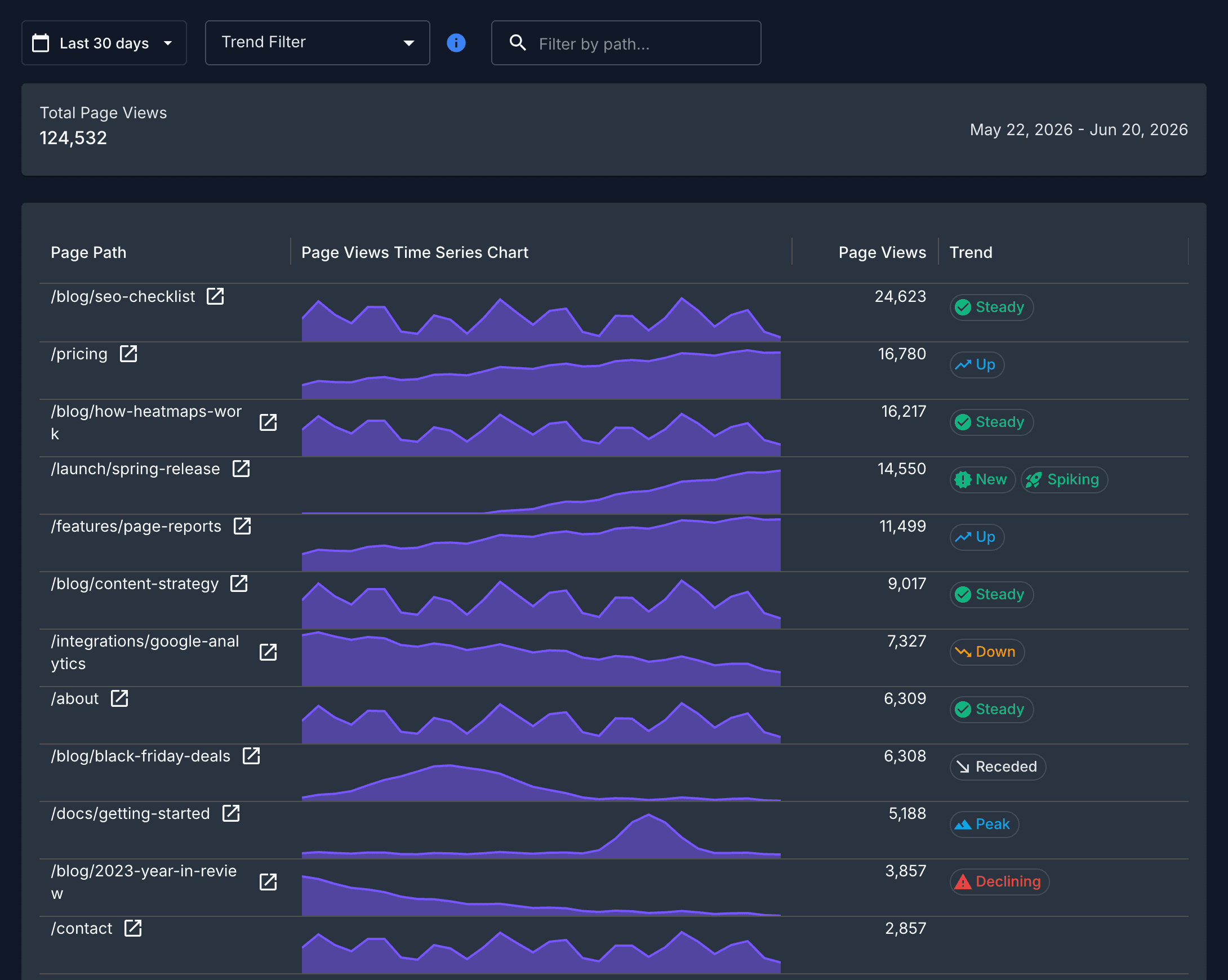
The short version
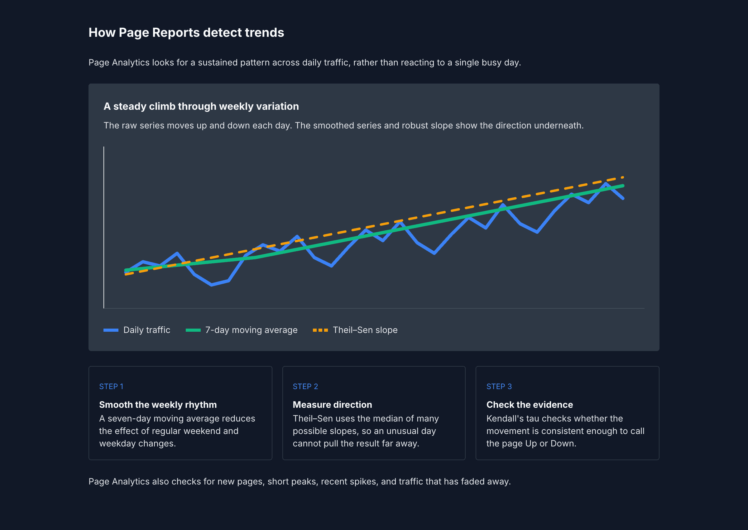
Page Analytics smooths out regular day-to-day variation, measures the sustained direction, then checks whether the data supports that direction. The illustration below shows those three views of the same traffic series.
Start with the chart
The labels are a way to find pages worth investigating. They describe the traffic pattern within the date range you chose. They do not predict future traffic or explain why a page changed, so open the chart and use the context from your site before acting on a label.
How Page Analytics finds a pattern
Find the active part of the series
Page Analytics starts with the first day a page received traffic and ends with its last active day. This stops the zeros before a page launch from drowning out the pattern that follows.
The zeros still matter. A page that starts late in the selected range and has traffic in the last week can be New. A page with a week of zeros after earlier traffic can be Declining.
Smooth the weekly rhythm
Traffic often drops at weekends or rises on weekdays. Page Analytics smooths the active daily series with a seven-day moving average, so that regular weekly changes do not look like a sustained trend.
Measure sustained movement
For Up and Down, Page Analytics uses the Theil–Sen estimator. It calculates the slope between every pair of points in the smoothed series and uses the median slope as the direction of travel. A single unusual day affects some of those slopes, but it cannot dominate the median.
Page Analytics does not draw this line or use it to forecast traffic. It uses the slope as a compact answer to one question: did traffic move steadily enough over the selected period to call it a trend?
It then checks the result with Kendall's tau, a rank-based significance test. This filters out slopes that look like random variation. An Up or Down label needs at least ten active days, an estimated movement of more than 25% across the active period, and a Kendall's tau p-value below 0.10.
Recognize other shapes
Some patterns are better described without a slope. Page Analytics checks for these shapes as well:
| Label | What Page Analytics looks for |
|---|---|
| New | Traffic begins after roughly the first third of the selected range and remains active in the last week. |
| Spiking | The last week averages at least twice the page's usual level, and the latest day remains high. |
| Peak | A short burst around the highest day accounts for at least half of the page's active traffic. |
| Receded | An earlier peak was high, then traffic fell well back from it. |
| Declining | Traffic stopped for a week after earlier activity, or a sustained fall ends far below the peak. |
| Steady | The page is active for most of the selected range, with a small slope and limited variation. |
A page can receive more than one label. For example, a recently launched page that keeps climbing can be both New and Up. When two labels tell the same story, Page Analytics keeps the more specific one. A Spiking label, for example, replaces a generic Up label.
Use labels as a shortlist
Use the trend filter to find pages that match the question you are asking, then open their charts. A Peak might be a campaign, a press mention, or bad data. An Up label shows a sustained pattern in the selected data; it does not identify the cause.
Change the date range when the answer depends on seasonality or a specific campaign. The labels recalculate for that range, which gives you a useful way to compare a short-term change with the longer picture.
See Page Reports for how to open a report, choose a metric, and filter pages.